Case study 03Amura HealthUX research
A visual could not fix a summary panel that was never designed for the people using it.
Care teams kept missing client details. The fix on the table was a visual on top of the summary panel. Field research showed the care team had stopped opening that panel. The real job was rebuilding it around what health coaches and doctors need during a live client interaction.
- Role
- UX Researcher. I led the research end to end and specified the information hierarchy.
- Duration
- 32 days of research and design. Rollout and measurement from March to May 2026.
- Participants
- 6 of 42 care teams: 12 health coaches and 6 doctors.
- Impact
- Across the same 282 clients, flagged friction from missing client data fell 49.7% between March and May 2026.
- Methods
- Situational client cases, five second testing, field observation, critical incident technique, affinity mapping, stakeholder validation, open and closed card sorting, MoSCoW prioritisation, information architecture, first click testing, scenario testing
What I was asked for and what I actually solved
“Add a visualisation of client’s data on top of the summary panel so health coaches and doctors can read a client at a glance.”
Care teams were missing client details because the summary panel had no at a glance view. A visual layer would close the gap.
The care team had stopped opening the summary panel. They were running client interactions from handwritten diaries. The same client details went missing again and again.
The summary panel did not surface what health coaches and doctors need during a live client interaction. It had to be rebuilt around both roles.
Why it mattered to the business: missing client context at the point of care created friction in conversations. When the same gap came up again with the same client, it turned into an escalation, which pulls in managers and wears down the care team.
What I led and conducted
- Team selection and the first study
- Field observation that surfaced the diaries
- Critical incident sessions and affinity mapping
- The interim tracking sheet
- Card sorting and MoSCoW prioritisation
- The information hierarchy
- First click and scenario testing
Who I worked with
- The Head of Health Coaches and the Head of Doctors, who curated the client situations and signed off the priorities
- Team leads, who checked nothing was missing and later flagged friction for the impact measure
- 12 health coaches and 6 doctors across 6 teams
What others built
- The UX team built the low fidelity panel from my hierarchy
- In that handoff we renamed it from summary panel to Client case panel
Reframe, stop the harm, then rebuild
The work ran in three movements: a prioritisation round that turned into a reframe, a fast intervention to stop client data going missing while the redesign ran, then the structural work that produced the new panel.
- First study: situational cases and five second tests1.5 weeks
- Discovery through field observation3 days
- Critical incident sessions, affinity mapping, sign off and the tracking sheet10 days
- Open card sorting2 days
- Closed card sorting3 days
- MoSCoW prioritisation1 day
- Information hierarchy2 days
- Validation3 days
Where the summary panel sits
The core health software is a five panel workspace that care teams use to supervise asynchronous clinical protocols. Panel 02, the summary panel, was built to give the clinical overview of a client. It was live across every team, yet field observation showed it did not support real time triage.
The clinical overview of a client. The space this project rebuilt.
Deciding what the visual should show
The ask was a visual summary layered on the existing panel. To decide what it should surface, I narrowed the 42 care teams to the 6 where client details were going missing most often, then ran two methods side by side with them. The output was meant to be a priority list for the visual.
Ranked on how often client details were going missing at the point of care
Situational client cases
Realistic client scenarios showed what a coach and a doctor each reach for first when the clock is running.
Five second testing
The current summary panel was shown briefly, then recalled. This measured what the existing layout actually surfaced first for each role.
The two roles read a client through different data. More importantly, both were working around the summary panel rather than from it.
They had left the panel behind
While running those sessions I noticed something the brief had not accounted for. Each clinician kept a physical diary covering all of their clients, filled in by hand. The entries were inconsistent and often incomplete. The same client details went missing again and again.
The care team was not supplementing the summary panel. They had stopped opening it.
A visualisation of the client data on top of a summary panel nobody opened would change nothing. The summary panel had never matched the way clinicians work, so it needed rebuilding from the data up.
A visualisation of client data on top of the summary panel
A summary panel that was never designed for either role
Making capture reliable before redesigning anything
The redesign would take weeks, but the gaps were causing harm now. So the first job was to get the right client data captured consistently, with the people who would use it.
- Step 01
Scenario sessions, using the critical incident technique
Six sessions, one per team, each working through five very different client situations. The Head of Health Coaches and the Head of Doctors curated them as situations that happen often and need careful handling.
- One session per team, so team habits stay visible
- Situations curated by the two heads, not by me
- Watch what they reach for, avoid asking what they want
- Step 02
Affinity mapping
I clustered the session notes until the data a coach must have separated cleanly from the data a doctor must have.
- Cluster by the moment of need, not by data type
- Keep the two roles separable through every pass
- A field earns a place only if it changed a decision in session
- Step 03
Stakeholder validation
I reviewed the priorities with the Head of Health Coaches, the Head of Doctors and the team leads, so nothing critical was missing before anything went live.
- Sign off from both role heads and the team leads
- Disagreements resolved in the room, not by averaging
- Step 04
The interim tracking sheet
I built a tracking sheet from the agreed priorities, so the care team could start capturing the right data on day one while the redesign ran.
- Ship the fix before the redesign, because the friction was live
- Every field maps back to a session observation
“I completely understand that doctors need to view the medical data first, but they do not interact with each client at least 3 times a day. We do that and for that we need to remember the last 2 to 3 requests or doubts and also how their behaviour is in general.”
Health coach, scenario session
“Maybe we should have separate dashboards.”
Doctor, scenario session
One panel that opens on what both roles share, then lets each role go deeper into what only they need. Separate dashboards would have split one client into two partial views.
Scroll sideways, the way the care team had to.
Before release, the Head of Health Coaches and the Head of Doctors added many more fields, because to them everything felt essential. I let the sheet grow. My real output was the information hierarchy of the panel. A wide, well maintained dataset would give me evidence to narrow with later.
Deciding what a clinician sees first
With capture stable, I designed the hierarchy for the new panel. The tracker could hold every field the heads wanted. A panel read in the middle of a client conversation could not. The question was never what data existed. It was what each role needs in that moment and what can wait.
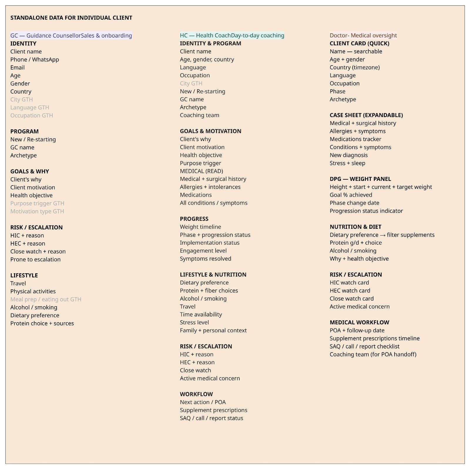
Five figures carry the decision, in this order:
- Figure 07What the tracker held
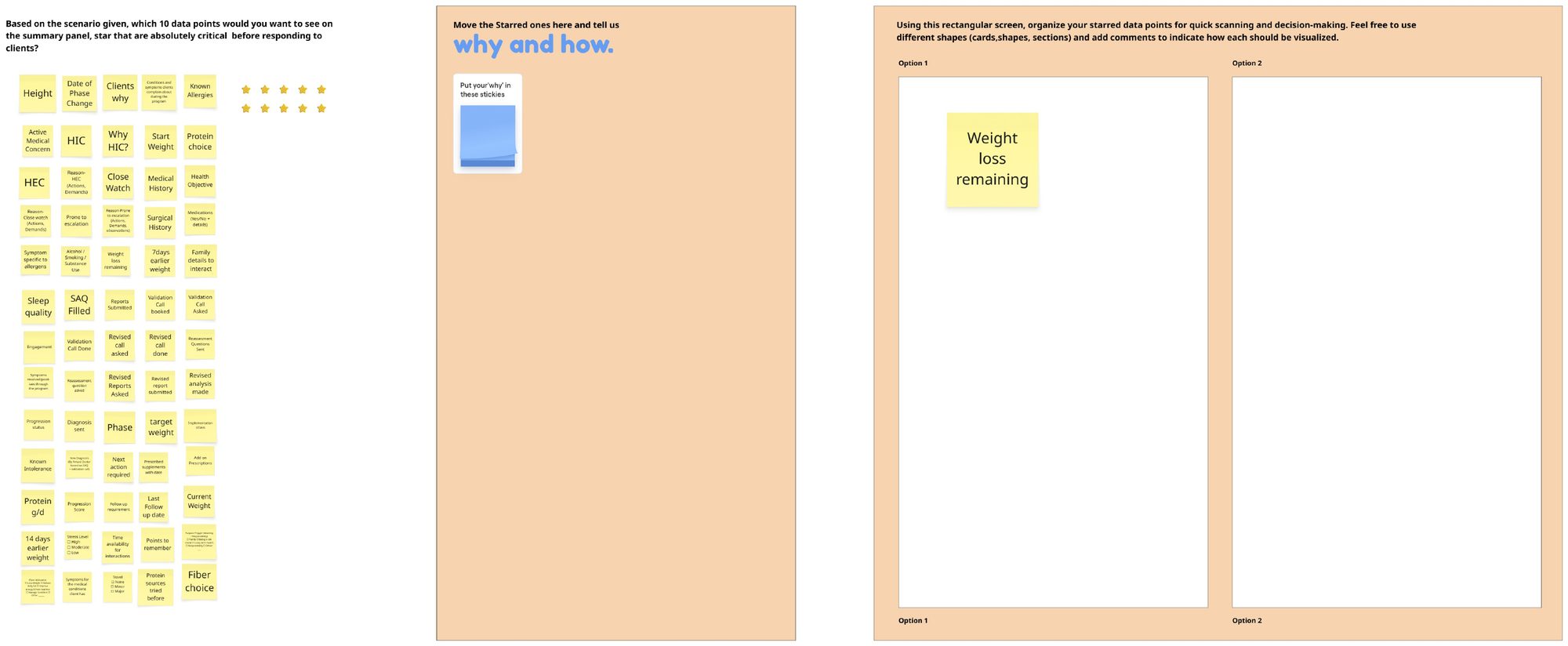
- Figure 08How the teams sorted it
- Figure 09Who needed what and where it landed
- Figure 10The new hierarchy
- Figure 11The panel it produced
Identity and case7
Client Name, Client Number, Treating Doctor, Coaching Team, Implementation Status, Status, Phase
Food data5
Dietary Preference, Pr g/d (g), Protein Choice, Fiber Choice, Identified Allergies / Intolerance
Progress10
21 Days earlier Weight (kg), 14 Days earlier Weight (kg), 7 Days earlier Weight (kg), Current Weight (kg), Start Weight (kg), Target Weight (kg), Weight loss remaining (kg), Start BMI, Current BMI, Progression score
Initial data9
Types of Client, Health Goal, Lifestyle / Occupation, Why / Value, Country, City, Gender (M/F/O), Age, Height (cm)
Risk and attention6
Next action required, Attention needed, HEC, Prone to Engagement, Medically sensitive, Active Medical Concern
Medical workflow8
SAQ Filled, Reports Submitted, Validation Call Asked, Validation Call Booked, Validation Call Done, Diagnosis Sent, Prescription Sent, Revised Prescription Sent
Medical data5
Diagnosed Medical Condition, Medication & Titration History, Add on Prescriptions, Hypertension, Diabetes
How I narrowed it
I wanted the cut made on evidence rather than taste, so three methods ran in sequence, each deciding something the next one depended on.
- Stage 012 days
Open card sorting
Clinicians grouped the fields freely against a real scenario, starring the ones that are critical before responding to a client. This showed the categories they already think in, not the ones the sheet imposed.
- Their labels, never mine
- Roles sorted separately, so divergence stayed visible
- Stage 023 days
Closed card sorting
The candidate groupings were then tested as fixed categories, to confirm the structure held when fields had to be placed inside it.
- A category survives only if roles place fields consistently
- Anything repeatedly misplaced gets renamed or removed
- Stage 031 day
MoSCoW with a top task lens
Fields were sorted into must, should, could and will not for the screen, weighted by the tasks clinicians perform most often.
- Only a must have for both roles can reach tier one
- Will not on screen still lives in the product, so nothing is lost
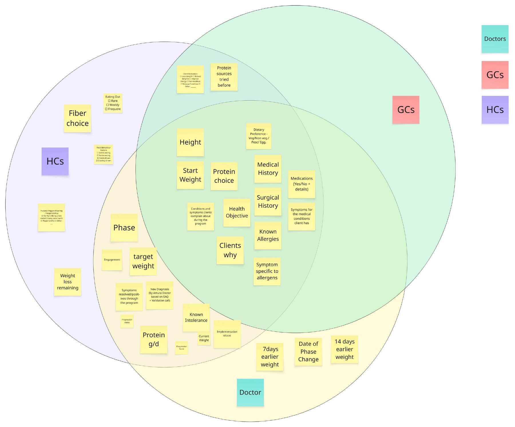
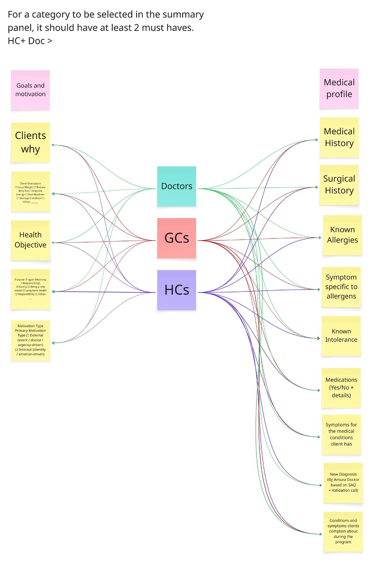
A field could only enter the summary with at least two roles marking it a must have. The health coach plus doctor pair carried the deciding weight. Qualifying was necessary, not sufficient: the MoSCoW cut kept tier one to what a clinician needs in the first five seconds.
| Field | Doctor | Health coach | Guidance counsellor | Landed in | Where exactly |
|---|---|---|---|---|---|
| On the case summary, always visible | |||||
| Phase and phase day | Tier 1 | Case summary: medical status, phase and day | |||
| Progression score | Tier 1 | Case summary | |||
| New diagnosis | Tier 1 | Case summary: diagnosed conditions | |||
| Conditions and symptoms reported during the program | Tier 1 | Case summary: active medical concern | |||
| Medications | Tier 1 | Case summary: current medications and dosage | |||
| Dietary preference | Tier 1 | Case summary | |||
| Qualified, placed one search away | |||||
| Height and start weight | Tier 2 | Client’s initial data | |||
| Health objective and client’s why | Tier 2 | Client’s initial data | |||
| Medical and surgical history | Tier 2 | Client’s initial data | |||
| Known allergies | Tier 2 | Food and diet | |||
| Target weight | Tier 2 | Surveillance data | |||
| Engagement | Tier 2 | Surveillance data | |||
| Client motivation | Tier 2 | Client’s initial data | |||
| Needed by one role only | |||||
| 7 and 14 day earlier weight | Tier 2 | Surveillance data | |||
| Fibre choice, eating out, food behaviour pattern | Tier 2 | Food and diet | |||
| Purpose trigger | Tier 2 | Client’s initial data | |||
| Weight loss remaining | Tier 2 | Surveillance data | |||
| Not on the sorting board, kept in the profile | |||||
| Phone number, emergency contact, birthday | Not sorted | Profile | Client profile, not the summary | ||
| Language, occupation, guidance counsellor name | Not sorted | Profile | Client profile, not the summary | ||
Case summary
Always visible. Read in the first five seconds. Shared by both roles.
Further details
Searchable, grouped in sections. Reached for during a conversation.
Deep archives
Secondary tabs. Opened only in a full clinical review.
In the handoff to the UX team the panel was renamed from summary panel to Client case panel, to signal a rebuild rather than a reskin.
Where the research became a design decision
The UX team built the low fidelity panel from the hierarchy. It opens on the case summary, then puts everything else behind search and grouped sections. Annotations from the build ask for a full view on hover for long medical fields and a sticky section header while scrolling.
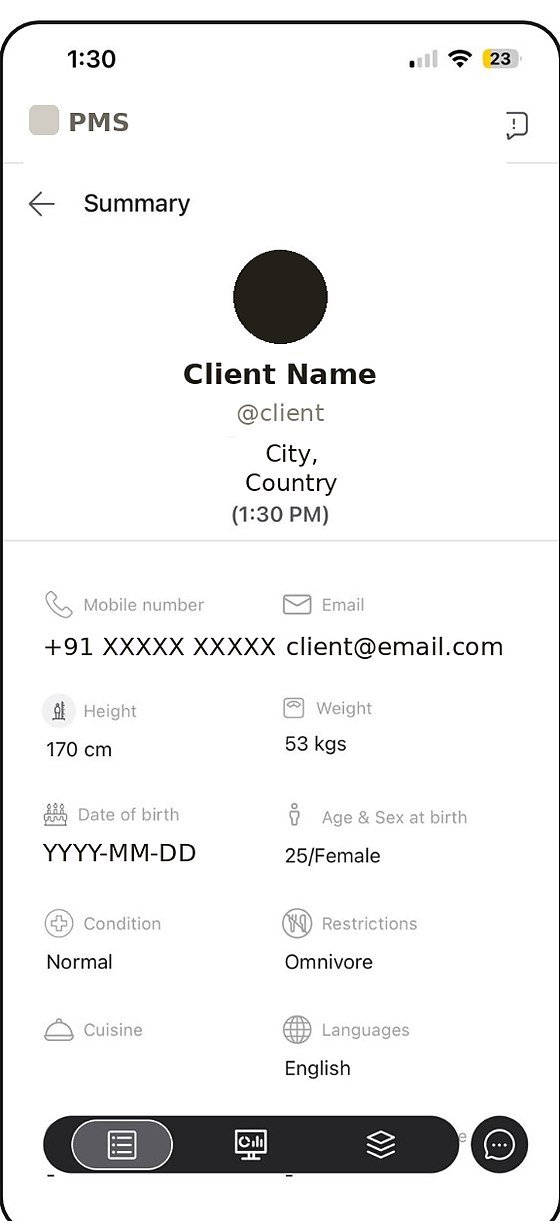
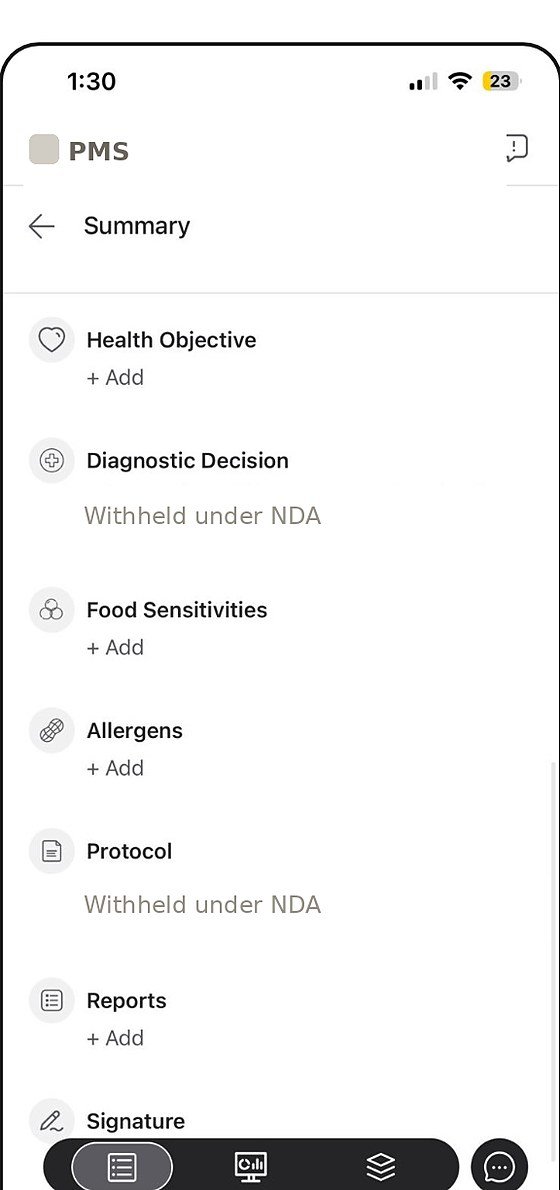
Identity fields up top, then an undifferentiated scroll of topics. Every retrieval was a hunt. Client details are redacted and clinical content is withheld under NDA.
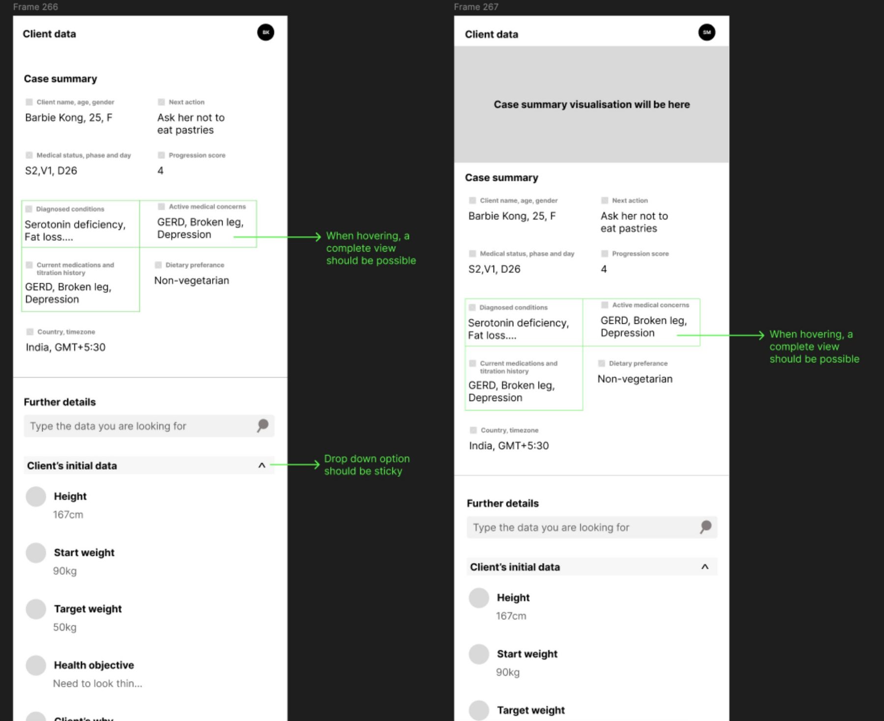
Built by the UX team from the hierarchy in Figure 10. The second frame keeps a slot for a case summary visualisation, the original request, sitting above a structure that now works without it. Sample data only.
Two questions decided whether the structure worked
The low fidelity panel carried every field from the tracker, so before it went further I tested the two things that mattered most in a live interaction.
Can a clinician find a specific parameter fast?
First click testing in the UAT lab · 12 health coaches and 6 doctors from the 6 teams
- Where would you click to find whether this client is prone to escalation?Expected path: tier 2, active patient management
- Where would you check what the client weighed two weeks ago?Expected path: tier 2, surveillance data
- Where would you look for the client’s last lab report?Expected path: tier 3, deep archives
Doctors found what they needed almost every time. Coaches sat lower, which tracks with the sorting: their data spreads across more of tier two, so more of their retrieval depends on the section labels rather than on tier one.
Does the case summary alone give enough to act on?
Scenario testing with real cases from past clients · reading tier one only · same participants
- A client messages that they have been skipping the fibre drink and feel low on energy. Read the case summary only, then say what you would do next.Does tier one alone support the right next action
- A doctor picks up a client mid phase with a new symptom reported. Read the case summary only, then say whether this needs escalation.Does tier one alone support a safe clinical judgement
For both roles the case summary covered what was needed in most cases. The exceptions were consistent:
- High engagement clients
- Clients who are extremely friendly and share a lot of context
- Clients asking for clarification on medical data
- Clients who have altered the protocol repeatedly
- Medically complicated clients
- Clients with many medical documents uploaded
- Clients who share a great deal of day to day life context
Tier one holds for the standard case. The exceptions are clients carrying more history or context than a summary can compress, which argues for how tier two is reached, not for putting more on the surface.
Friction from missing client data, before and after
- Business problemMissing client context at the point of care caused friction. Repeat gaps with the same client became escalations.
- Research findingThe care team had left the summary panel for handwritten diaries, so capture was inconsistent.
- InterventionThe tracking sheet made the required fields explicit for every client, while the new panel was designed.
- Observed outcomeAcross the same clients, flagged friction fell by about half.
Each team lead flagged, per client, where missing data or context created friction at the point of care. The same 6 teams and the same 282 clients were measured twice: first in March 2026, when those clients sat in phases V1 to V3, then in May 2026, when they had moved to V3 to V6. This measures the capture change. The new panel was not yet live in this window.
March 2026, phases V1 to V3May 2026, same clients, V3 to V6
Friction points per client, teams ordered by their March load
The numbers behind the chart
| Team | Clients | March 2026, phases V1 to V3 | May 2026, same clients, V3 to V6 | Change | ||
|---|---|---|---|---|---|---|
| Flags | Per client | Flags | Per client | |||
| Team 41 | 46 | 116 | 2.52 | 54 | 1.17 | 53.4% |
| Team 4 | 39 | 98 | 2.51 | 47 | 1.21 | 52.0% |
| Team 27 | 57 | 102 | 1.79 | 56 | 0.98 | 45.1% |
| Team 20 | 52 | 113 | 2.17 | 59 | 1.13 | 47.8% |
| Team 11 | 39 | 87 | 2.23 | 42 | 1.08 | 51.7% |
| Team 35 | 49 | 92 | 1.88 | 48 | 0.98 | 47.8% |
| All six teams | 282 | 608 | 2.16 | 306 | 1.09 | 49.7% |
An effect that shows up across six teams working independently is hard to attribute to any single team’s habits. Part of the fall still reflects clients maturing into later phases with fuller records, so I read it as the capture change plus natural maturation, with capture as the lever the team could actually pull.
What this study can and cannot claim
- One organisation, 6 of 42 teams. The findings describe how Amura’s care teams work, not clinical tooling in general.
- Small validation samples. 12 coaches and 6 doctors make the first click and scenario results directional rather than precise.
- A judgement based measure. Friction was flagged by team leads, applied consistently within the study but not an external standard.
- No control cohort. The before and after follows the same clients across program phases, so maturation shares credit with the capture change.
- The panel itself is not yet measured in use. The impact reflects capture through the tracking sheet. Validation of the panel happened in the lab.
If I were taking this forward
These are open questions the study leaves, not work that has happened.
Separate capture from maturation.Compare a cohort moving from V1 to V3 into V3 to V6 without the tracking sheet, which would isolate how much of the drop the capture change caused.
Test the panel in live workflows.Lab first clicks show where people look. Live use shows whether the hierarchy holds once the panel is no longer new.
Measure time to retrieve.First click success says whether people start in the right place, not how long a live answer takes. Timing it would show the real cost of a tier two lookup.
Stress tier one as complexity grows.Scenario tests already named where the summary runs out: high engagement, medically complicated and heavily documented clients. Those cases are where the next iteration should be tested.
Check the coach gap.Coaches trailed doctors on first click. A tree test on the tier two section labels would show whether the naming is the cause.
Include guidance counsellors.They were on the sorting board but not in validation. They also collect the first client data the panel depends on.